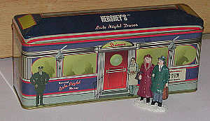
Our Diner tin is scaled smaller than our people, and the diner has people lithographed on its side. We have two reference points to overcome: too-small doorways and too-small people. Placement close to the door makes our standing figures look too large. The same goes for placement too close to the lithographed human images.
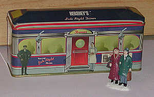
By stepping our figures forward and to the side, we evade these reference points. A sense of perspective is restored.
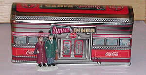
The doors on this diner are too small for our figures, as are other details. Placement of our figures to the side does little to mitigate the difference.
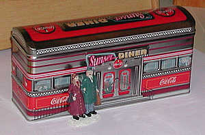
Another view - the people look like giants.
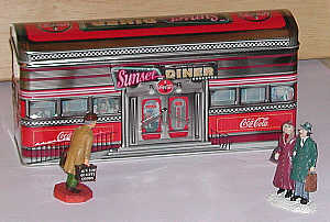
Placement forward and further away from the door works. That door is like a measuring stick, and we don't want to be any closer to it than we must. Note figure heading toward the diner. His movement works well with the movement implied by the handrail.
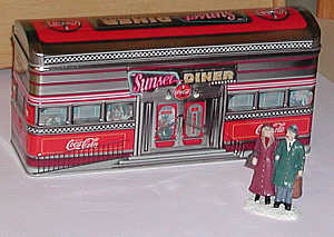
The door is closer laterally by an inch or two. Here figures are moved further forward to compensate for loss of lateral distance. This works well.
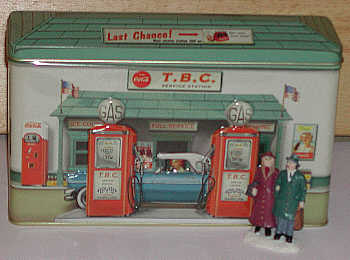
This gas station is lithographed with its own perspective. The result: the pumps loom larger, the doorway smaller, and the car just the right size for our figures. The reference point is the pumps, especially the pump handles. Figures placed here look undersized. However, such placement would be tolerable in a pinch.
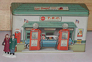
Again, we need move to the side and forward, away from those looming tall reference points! This placement is a little better. The element we need to understand is that our people figures are just right for the car, but between them and the automobile is an element that outsizes both. The best case would be an even taller figure , for just this scene The scene itself would have to be separated from other scenes by a line, trees, etc.